Is mobile-first still relevant for foldable devices and VR/AR?

I’ve been asked if Mobile-First approach is relevant as we step into the new era of Fordable (and Flexible, Rollable, etc.) devices, and even more important— Spatial Computing (VR/AR/XR) era, which is the future of computing. Not only in terms of Tech, but also in terms of Human-Machine interfaces and the way we, humans interact with technology in a natural way (NUI).
Why? According to the leaked information from Apple’s internal presentation, AppleGlass will ultimately replace the iPhones, since the capabilities of their AR glasses will make the iPhones obsolete.
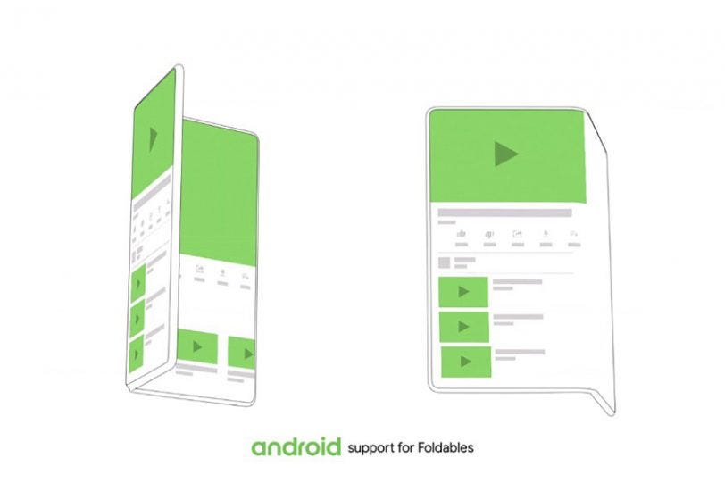
The Foldable era:
So, I can’t say if mobile-first is dead (yet) but surely it is here to stay even in foldable era. Why? Because for quick interactions people will need apps to support the “mobile” form factor with a smaller screen without unfolding their device to “Tablet / Desktop mode”.
The XR (VR+AR) era:
As for VR and AR (XR) and Spatial Computing in general, well… This is an entirely different story. Because, even if you have no experience in Spatial Design and never designed for VR&AR, you have probably tried some form of VR/AR glasses, such as the Oculus Quest (VR), or even Microsoft’s HoloLens / MagicLeap ML1 (AR/MR).
And on this form factor (VR/AR) most of the websites and apps are working just fine, even the apps / websites that are not designed for mobile devices. Simply because the default view on VR/AR HMDs is something between Desktop mode to a Tablet Mode (depends on the display)…
I believe there is an advantage in making your app / websites “mobile friendly” even if you never made it “mobile-first”, at least make an effort to implement Responsive Design. Because it is relevant even for VR and AR, in order to allow users to shrink or resize their Apps / web-browsers and place them in the space.
For example: Now that I got the V30 update for my Oculus Quest 2, It’s great to see that most of the websites are responsive so I can easily shrink my browser window and put it next to another browser window or any other supported app. So users should be able to arrange a VR/XR workspace and keep everything in front of their eyes to keep working without the need to constantly move their heads left and right.
After all — the FOV is limited, so until we’ll see more and more VR & AR devices with 4K/8K displays and larger FOV, we will have to shrink/resize those apps and websites (horizontally) in order to keep everything in front of our eyes. This Tech is still in its infancy and no one knows how will it evolve, that’s why I’m so excited about XR and following it ever since 2009 (my first AR experiment) and my first VR app in 2014, and XR is still evolving!
Feel free to comment and share your opinions and experiences if Mobile-first or Responsive design made your life better even on VR/AR form-factors.
TL;DR — No, Mobile-First is not dead (yet)! 😉
More about Mobile-First.
Follow me on: iBarel, Medium, Facebook and LinkedIn
For more VR/AR articles, tutorials, and experiments from me, visit IMXR.
Leave a Reply