It’s always nice to see that even on XDA developers community there are more and more discussions and articles about UX, it’s the ultimate proof that today’s developers have a great interest in design and they understand how important it is for their users. take a look on this interesting thread on XDA, talking about the advantages (and disadvantages) of Google’s Material Design.
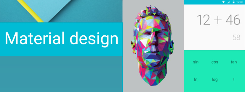
“Material [Re]design
With Material Design seeing increasingly widespread adoption, it is clear the environment is here to stay for the foreseeable future. As such, we are seeing developers and users a like voicing their opinions on the new style frequently, but how does the community as a whole view MD? We recently asked you whether you preferred Material Design or Holo. The results clearly showed a rift between the two camps with many of you liking the concept of MD but yearned for the darkness offered by Holo. App developers have been seen to be more positive of the new style as it has brought a potential end to fragmentation between user experiences, we also spoke with several developers here at XDA that have implemented MD in their apps. There is a sense of optimism about the changes and how they will affect the future of their apps.
You The Community
The question we asked was a simple one “Do you prefer the new Material Design implemented in Android, or the previous HOLO?” and we saw many excellent points in favour of both. Here are just a few of the responses we thought best answered the debate.
gaspernemec – “Material ALL the way, I mean android finally got rid of that boring greyish/black design and went to something modern more colorful in mix with white design, plus some pretty awesome animations. It’s better design from every point of view.”
meyerweb – “Holo, without question. MD is too bright, too gaudy, and the color combinations must have been chosen by someone who is color blind. And all the animations are cute for the first week, then they’re just tiresome and make the UI slower.”
iks8 – “I love material but it’s pretty heavy and app design is very inconsistent right now. Even google apps have different style (for example some apps has side menu overlapping status bar and some haven’t)”
vyis – “Definitely holo. Material design is work of an artist, looks over function.”
Chilly Hellion – “I vote Material Design. When Holo came out, I remember thinking that it really worked for Android and it was a good design for mobile. But when Material Design came out I thought about how much I’d like to see the design implemented on other platforms as well. Holo is great, but Google really knocked it out of the park with Material Design.”
neonixxx – “I like flat graphics, but I don’t think *everything* has the be flattened. The glowing overscroll effect from KitKat was definitely a more pleasing effect. Although, this is such a minor thing anyway; it doesn’t bother me too much.”
Development is at the heart of our community, it is likely that with an increased uptake from app developers we will also see a positive increase in our micro-societal perceptions of the platform. Most of us will have noticed the new sense of consistency between applications and surely that can only be a good thing. With that in mind we reached out to several of apps developers here to find out how they felt and what they have in store for the designs of their apps.
Andrognito 2
“Material Design is the biggest design overhaul to come to Android, and it’s amazing in every way. It’s bold, beautiful, elegant and simple. We now have a design language to follow and create consistent experience for the users. MD is heavily inspired from our real world objects and their behaviour and that is what makes it even better. Personally, as a developer and an avid Android user, I liked almost everything about Android except its UI pre-Lollipop. But now I am absolutely amazed with its beauty, simplicity and elegance.
Currently, I have lots of new features like Pattern Lock, Stealth Camera, native photo and video viewer, etc to add to Andrognito. But specifically in terms of design, I would love to give more customizability to the users like a full-fledged Theme Manager in-built in the app. Users can change the themes, colors, fonts and much more. Mostly, we have received positive reviews on the Dark UI of the app, but we would also like to bring a Light version on user demand. We are also looking forward to add more Material-inspired animations everywhere in the app.”
Smart Unlock
“I think Material Design is a step forward in the right direction. Finally Android has the look and feel that it deserves. You can create very intuitive applications, beautiful and with pleasant animations. We will not change much with the design as we are happy with it and most users seems to like it too. We will likely add an intro tutorial on the first app run, with some slides similar to how Google does on most of their apps, showing how to use the app (despite it not being necessary for most of the users) Many users have also requested a toggle to switch to a “dark” theme version of Smart Unlock, we may consider it for future addition.”
Hi Locker
“I liked MD from the first time I saw it. It’s beautiful, smooth but modern. MD create a standard that enables applications to be homogeneous, so the user will feel easy when using different apps. MD has created a balance on the UI between iOS and Android than before. Currently, I have applied MD for my apps and for the future as well. But I will try to create the difference in my design style than the other apps.”
Corgi
“I think Material Design is just revolutionary, it makes so much sense. Mainly, in my opinion, it solves 2 very important problems. Firstly, it helps developers, who might not have so many design skills, to create beautiful apps just by following the guidelines. This let’s developers spend more time on crafting ideas instead of designing them. Secondly, it helps to keep the Android UX aligned and in my opinion it is very important. From my personal experience, using Material Design apps is just awesome, everything feels so intuitive and easy to understand. Once you learn how one app works, all the others are easy, since they are quite the same. In a couple of years, we might get bored of the bold colors and the material design “layers concept” but I’m pretty sure we will get addicted to the unified design all over the OS and its 3rd party apps. This is the future!
For sure we are going to keep up the Material Design, but we are going to tweak the apps experience. Some of the things we implemented like the “+” button containing shortcuts, might not be as useful as we’ve expected. But mainly these are the small things. One big thing we are going to implement is the list view, the type that Feedly has, showing multiple articles on a page. Another thing, is that the settings menu is still quite empty, we will be implementing new options there, that will let user tweak the design themselves. Lastly, we will be adding notifications to the lock screen, something all of our Lollipop users are demanding. Overall, we have a lot of ideas and concepts in our head both for Corgi and other apps but the main thing we are aiming for is to design new ways of how we consume content.”
With less than a year having passed since its unveiling at last years I/O, Material Design is still very much in its infancy. Love it or hate it, the new style benefits us in ways other than aesthetics, providing simple guidelines for new potential developers it could become a keystone to Android over the coming years. ”
Source: http://www.xda-developers.com/material-redesign/]]>
Leave a Reply