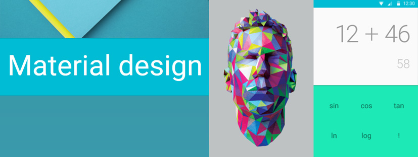
Although Google’s material-design guidelines for designers and developers are fine and beautifully documented, it looks like google themselves are the biggest “sinners”, when I tried Android (5.0) Lollipop for the first time, I noticed the inconsistency in google apps (especially the spinning “hamburger menu” behind the sidebar?!), and obviously I wasn’t the only one… It turns out that there are more inconsistent design-languages in Lollipop, and I’m not talking about third-party applications, I’m talking about Google Apps! I hope that Matias Duarte is aware… 😉
There is a great article on XDA by Mario Tomás Serrafero, talking just about that, take a look!
Source: xda-developers.com
Leave a Reply